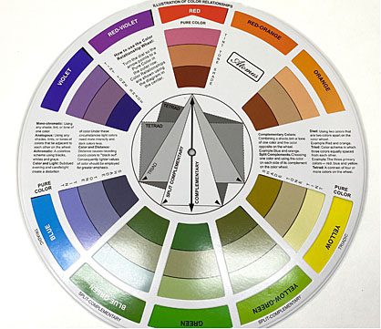
I am no stranger to using lots of color in my work and I often get complimented on the color combinations I use. And while it does come fairly natural to me, it’s not magic, it’s science! Remember that color wheel from Elementary school? Well, dust it off because that baby will be your best friend if you struggle with finding the right color combos. It starts with the primary colors, (red, yellow, and blue) which form a triangle. In between each of those colors are the secondary colors, which are formed by adding the primary colors together. (orange, green, and violet) Then there are the tertiary colors which are formed by adding a primary color with the secondary color that is next to it on the color wheel. (red-orange, yellow-orange, yellow-green, blue-green, blue-violet, and red-violet).

Going off this color wheel, there are seven major types of color schemes – monochromatic, analogous, complementary, split complementary, triadic, square, and tetradic. I won’t go through all of them here, but let’s talk about my 3 favorites.
A Split complementary scheme uses a dominant color, and then two colors directly adjacent to that color’s complement (the complimentary color is the color directly across from it on the color wheel). Let’s say I want to use this beautiful mint green color, which is a tint of blue-green. The two colors that would go best with it are some tint of red, and some tint of orange. So, if I pull in this pretty pinkish red, and this bright peachy shade, it makes a nice palette.

If I wanted to balance it further, I could add another tint of my dominant blue-green color.

Analogous color schemes use one main color and then the two colors directly next to it on the color wheel. If you want to take it further, you can add the two colors next to the outside colors also. Since there is less contrast with this color scheme, they tend to create a softer palette. Analogous color schemes can create some gorgeous blends and ombre effects too. Using Red-violet as my main color here, I have created a beautiful and vibrant analogous color scheme.

A square color scheme uses four colors that are equal distance from each other on the color wheel. These colors create a nice contrast and allow a wide range of colors (my favorite!) Here, I’ve chosen a bright green, blue-violet, pinkish red, and a warm tone of yellow-orange. You may not have thought to put that seemingly neutral tan color with those brighter colors, but because it has a lot of yellow-orange undertones, it fits perfectly.

Speaking of undertones, think about that when choosing your neutrals! Let’s look at these grays. They all have a different undertone. If I wanted to pair this light blue with a gray, you can see it pairs well with the bottom left which has a blue undertone (monochrome color scheme) or the top right which has an orange undertone (complimentary color scheme), but not as well with the top left (yellow undertone) or bottom right (red undertone).

I hope this little trip back to art class was helpful! We’d love to see all the fabulous color combos you come up with! Be sure to tag #howdoyousculpey so we can see you rocking that color theory!


